Color is an important factor in graphic design and visual literacy. It shapes our perceptions and affects our emotions
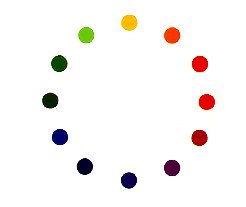
When people talk about the color of something, they are usually referring to the hue of that object. All of the colors of the rainbow are actually different hues in the visible spectrum of light. The different wavelengths of light reflected off of an object are responsible for these different hues.
Most people are familiar with hue through our labeling of three hues as the "primary colors": red, yellow, and blue. These three hues were chosen for rather arbitrary reasons, but their significance is that with any three different hues (red, yellow, and blue work well), one can create any other color by mixing light of these three hues. Painters have these three hues as their "primary colors" because it is easy to get very saturated versions of these hues in paint, and with them they can mix paints of other hues.
Likewise, with three different hues of lights one can create thousands of hues by mixing them in different proportions.
In terms of visual literacy, however, it is more relevant to group the different hues into two categories: warm and cool. Basically, red, orange, yellow, and other similar hues are warm. Blue and its close cousins are seen as cool hues. By examining the balance of warm and cool, and the presence of primary colors, we can get a good sense of what is going on in an image visually.
Mood can be expressed through hue. Each hue is associated with different emotions. Red evokes feelings of strong emotion or anger. Most likely, this association is derived from the feelings we get when we see blood. Blood red is the ultimate red. Blood red represents passion, anger, and pain; all very strong emotions. Therefore, in films, red is frequently used for prostitutes, and fast cars. Red suggests extravagance and ostentatiousness.
Blue, on the other hand is cool and passive. these feelings are probably related to the blue ocean or sky. Therefore, blue is frequently used to stand for truth in blue uniforms and the American flag, for example.
Yellow is cheerful, and warm, perhaps like the warm yellow
sun. White's association with innocence may have originated with
the pureness of snow, for instance. The epitome of innocence in
the media would be a girl in a white dress with light blond hair
and a white lily. Black represents evil because it is associated
with the darkness of the night. Therefore, black is worn by vampires,
and burglars. These are a few examples, among many, that illustrate
the way in which the feelings
associated with certain colors can affect the way these hues are
used in media; non-verbal cues that send a message or enhance
the mood of the picture or scene. - The
On-Line Visual Literacy Project
Saturation, which is the amount of gray in a particular color. A color with more gray is considered less saturated, while a bright color, one with very little gray in it, is considered highly saturated. The amount of saturation does not affect the basic hue of a color and it also is unrelated to the value (amount of light or darkness in a color.) For example, if we take away the colors in an image, the tonal values will remain. However, taking away the colors themselves will make the image completely unsaturated. A more saturated color is also called a more 'pure' color because it is undisturbed by gray.
The saturation of a color can also affect our emotional reaction to an image. Colors that have low saturations are often seen as dull and boring, but can also be thought of as restful and peaceful. Highly saturated colors, on the other hand, are more vibrant and emotionally aggressive. When we look at an image in which the colors are highly saturated, our attention is grabbed. Movie makers use this aspect of saturation all the time in order to convey particular feelings. - The On-Line Visual Literacy Project
The visual element of value or tone is, in its simplest form, the juxtaposition of light and dark. It is defined as the intensity of lightness or darkness in anything that is visible.
In nature there are hundreds of different steps in value that are sometimes not easily distinguished by the human eye. In the graphic arts and photography, however, there are far fewer steps because they are simply to subtle to perceive visually. Images derive a simulated natural tone from pigment, paint, or nitrate of silver. Thirteen steps in value have been identified, which range from white to black. These steps are based on a tonal scale, which defines the variations of shading.
The element of value is used to express emotions, form, space,
and movement as well as to give off the illusion of light.
Since the scale for value is so limited in two-dimensional images,
it is implied through several techniques. The juxtaposition
of elements within a work determines value. This is achieved by
placing the lightest element next to the darkest. One way to
comprehend the importance of value is to count the shades in an
image from lightest to darkest.